Implementing e-commerce and enhancing the UI/UX of Bulgarian flour-making company
Digital transformation for MELKO
Sept 2024
Project Snapshot
Duration
8 weeks
Tools
Figma, Custom code
Deliverables
Full Website UX/UI Design, Branding and Business enhancement propositions
Business problem
Melko's existing website hadn't been updated in decades. It lacked basic structure, responsiveness, or product discoverability. Their digital presence was far behind the competitors.
Issue
The original website had no search, filters, or clear catalog functionalities. The user experience was little to absent.
Solution (Design)
Rebuilding Melko’s website from the ground up, both structurally and visually, with modern layout and ecommerce
↓ Case study - Deepdive ↓
End result (Project outcome)
After multiple iterations in Figma for the whole website design, and communicating with the Melko's marketing team, the website was coded and 90% ready for a launch. The homepage, product pages, recipe section, cart, catalog and checkout flows - all were done. But the site was still never launched due to differences in the expectations with the final decision-maker for our client.
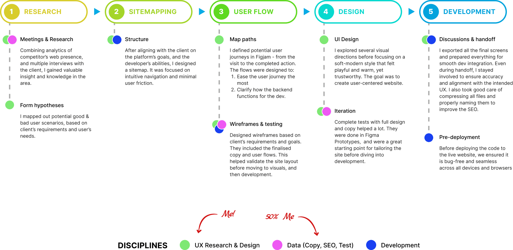
The approach was to modernise the client's website from the inside out, while keeping it grounded in actual user needs.
1.1 Overview
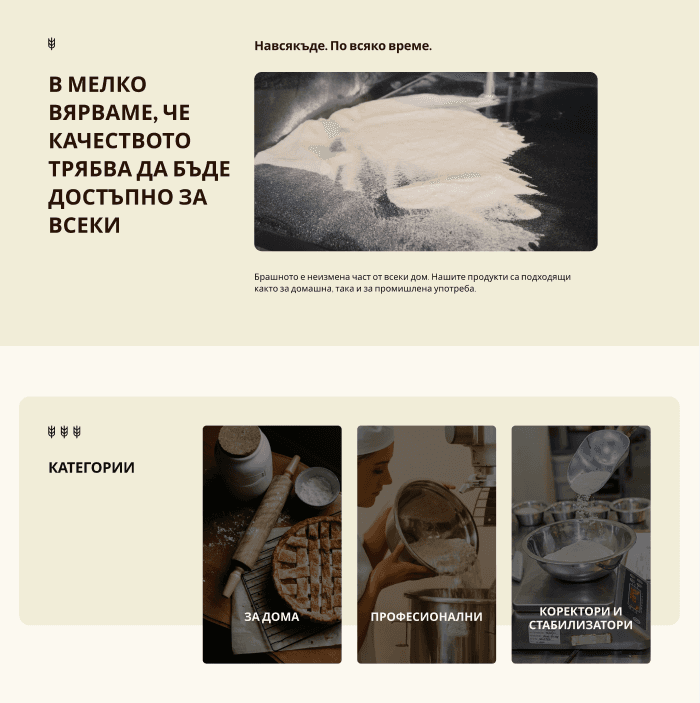
Melko's old website had no real functionality or user focus - just a static catalog. Their online presence was not like their physical one. My task was to reshape this into a modern, responsive platform that reflects the premium quality of their products and improves usability for their mostly B2B customers.
1.2 Tech & SEO
After discussions with the developer, I had to focus on laying a solid foundation for SEO-friendly structure. This also included:
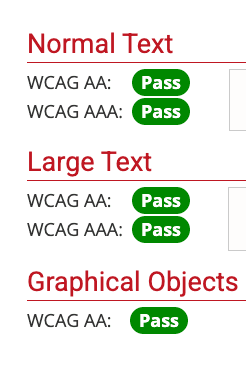
Contrast and accessibility checks
Clean URLs and images
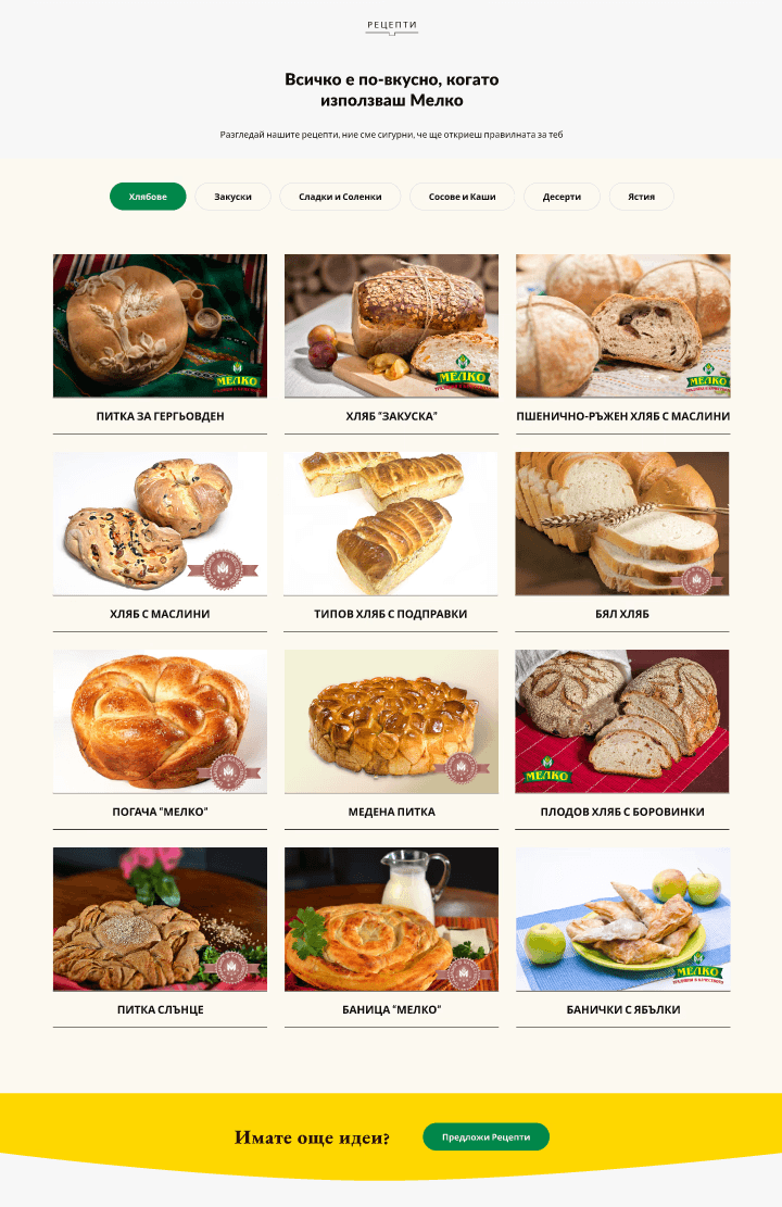
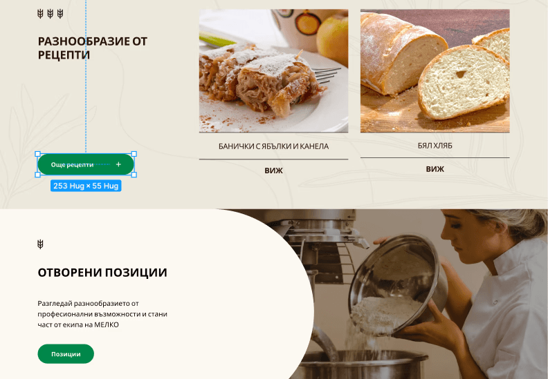
A custom Recipes page for future organic traffic opportunity (like a blog page)


1.3 Audience and Purpose
After multiple meetings with the team of our client, I had a clear idea who the target audience was going to be. To put it simply, it was 80% B2B buyers such as distributors, grocery stores and bakeries, and 20% individual customers.
I had to think about everything that the current website lacked:
1.4 Final Direction
While the Melko team often looked toward their competitors for inspiration, I challenged them to rise above copycat design, we had to be even better. My direction was guided by some of the ecom leaders, and the logic behind their user journeys.
This meant: better branding, clear CTA logic, strong layout rhythm, and emotional clarity.

Successful user flow with system actions
2.1 Design key elements
I introduced richer green to replace the original brighter tone, helping the brand feel more mature and up-to-date.
For the homepage, I managed to provide a great license-free and professionally made video, that we just couldn't resist but use. It included windmills, wheat field and sacks of wheat, as well as human presence.
2.2 UX logic
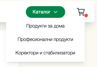
After aligning with the client, I proposed merging their shop and catalog and splitting it into 3 sections:
Flours for Home use
Flours for Professional use
Correctors and Stabilisers
This structure came from conversations with their team, and the goal of it was to simplify the buying journey.
2.3 Problem solving & designing
As a designer, I have to prioritise hierarchy above all - not just visually, but structurally and content-wise too. One of the constraints was explaining to our client that we can't have a website that's both ecommerce-driven AND information-heavy, because that way, it will lose its its purpose and clarity.
I had to step in and explain that trying to serve both equally would hurt the UX for everyone, and eventually, we leaned more into the ecommerce side. This helped me make decisions based on real user priorities, not internal politics.
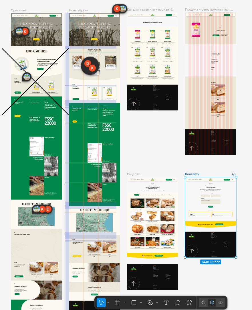
Multiple homepage iterations in Figma
3.1 Finalisation & Handoff
The final design was tested across multiple devices to confirm consistent performance and visuals. After making small UI refinements, I prepared the files for developer handoff, including:
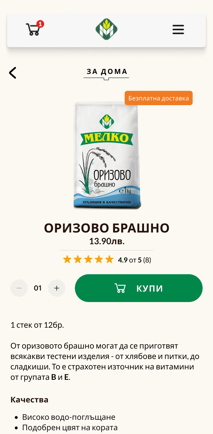
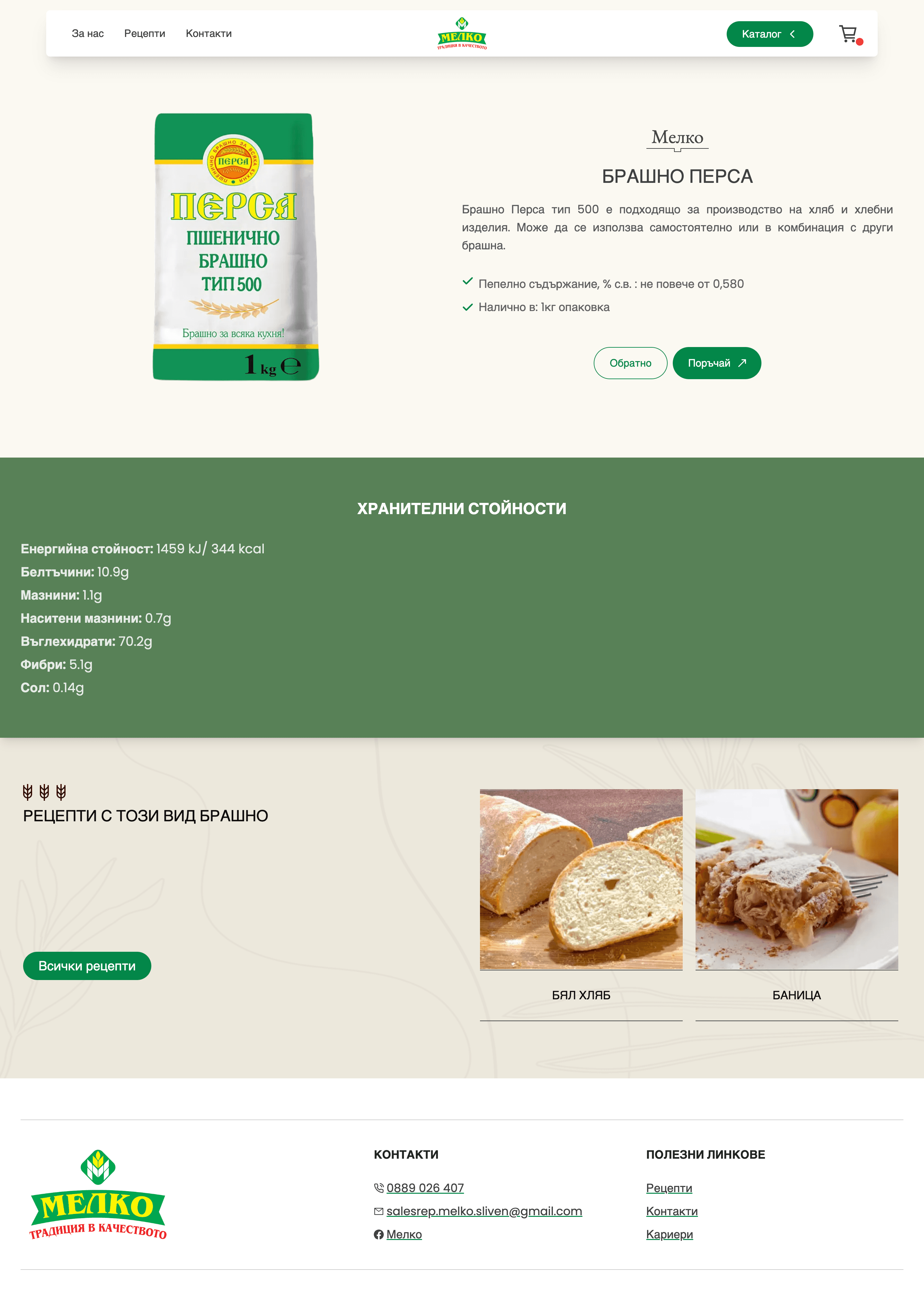
Mobile product page design
4.1 Outcome & Reflection
The result of this project featured a solid-foundation - a modern, brand-focused UI, and most importantly - scalable.
I saw how design decisions can transform even the most traditional businesses, but only if they are ready to dive and trust the process. The project sharpened by skills in designing within real business constrains. And even though it didn't go live, it remains a great case of pushing a brand towards more modern UX and UI principles.