Improving the online gallery in a Squarespace-built site for wholesale clients
Relaunching Mr. Baker to the world of Greek baked goods
Sept 2024
Project Snapshot
Duration
4 weeks
Tools
Figma, Squarespace, Facebook Meta
Deliverables
Full Website UX/UI Design & Build, Meta Ads, SEO
Business problem
Mr. Baker needed a digital home that reflected their offline reputation of a trusted B2B supplier of traditional Greek pastries. The issue? Their current website didn't live up to that.
Issue
The original website felt outdated, lacking basic hierarchy, information architecture, or responsiveness. Users such as café/bakery owners couldn't get the proper information.
Design (Solution)
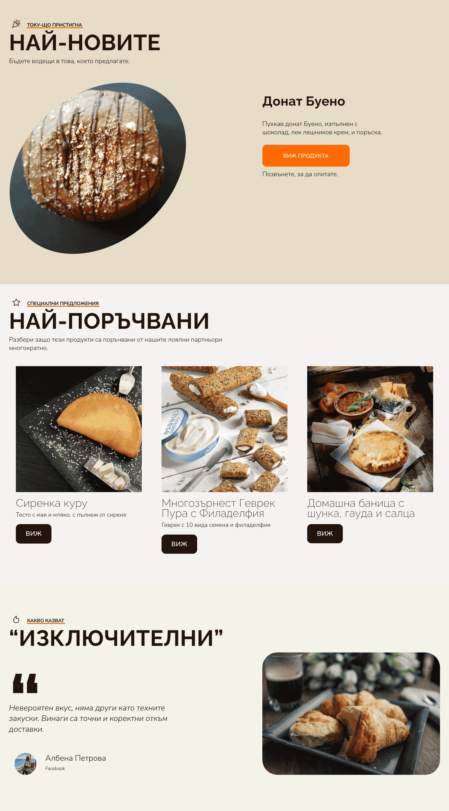
I worked on Squarespace to create a clean, image-first experience that showcased the products while staying structured and informative.
"We have great product photos. Show them off and let them speak" - the website needed to feel like a digital tasting experience.
↓ Case study - Deepdive ↓
End result (Project outcome)
I had a mission the client wanted to strictly keep - to ensure that the great photos are shown appropriately. After all, the eyes eat first. Additionally, the website needed to be built on Squarespace - a platform I had little to no experience in. However, due to its user-friendly nature, I managed to learn a lot for a short period of time, and am proud of the final product.
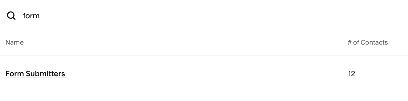
+12
Total Contacts via the form
+30%
Average Session Length
When designing for B2B, building trust and credibility matter more than being flashy
1.1 Defining the Problem
Mr. Baker needed a B2B-centered website, highlighting their premium baked goods, and making it easy for business owners/managers to browse and inquire.
1.2 Constraints
The redesign had to be built entirely on Squarespace - platform with rather limited flexibility
I had to re-create the brand identity, which would then be used for Meta ads
2.1 Approach
First, I dived into the brand story - we have to use it to build credibility. What makes Mr. Baker Mr. Baker? Through interviews and discussions with the owner, I landed on a few pillars:
2.2 Design Direction
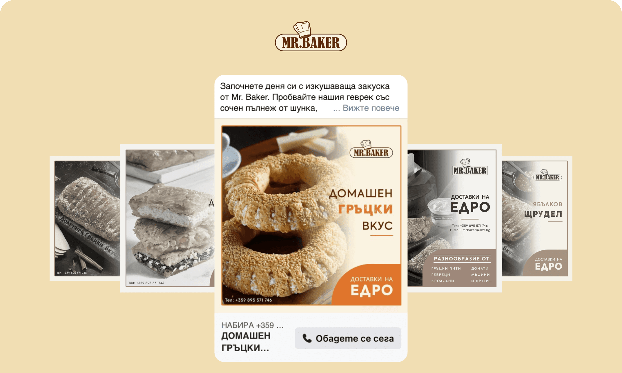
I reimagined the brand color palette in warm orange and beige tones to evoke authenticity and warm welcome feeling. These colors were later also used in the Meta Ad Creatives.
2.3 Visual-first Layout
Balanced with spacious layouts, bold text and photography in order to keep photos on the professionally-photographed baked goods. Each product includes a CSS-coded table with baking details, and minimal copy.

3.1 Visual Direction
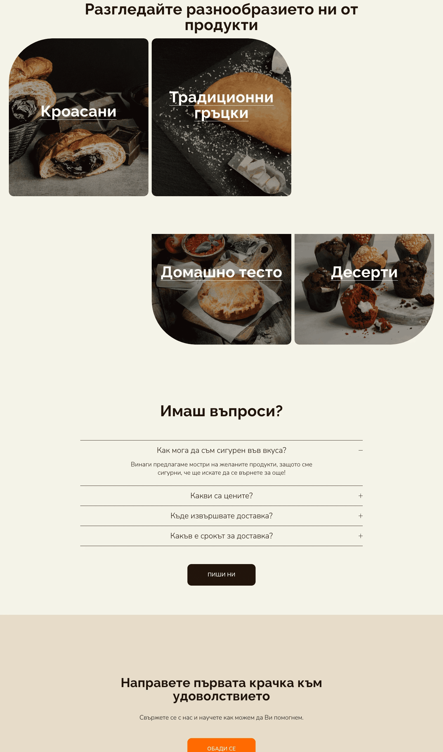
Categorised content into four main sections. Simplified navigation allows the users to jump to relevant categories quickly.
3.2 Feature Additions
Brand Color system applied consistently across website sections and Social media
Two product videos created to highlight the quality, variety and build even more trust
3.3 Campaigns - Meta Ads
I designed branded Meta Ad Creatives targeting Bulgarian café, bakery and restaurant owners. Used consistent imagery and ad copy to match the site and boost traffic.
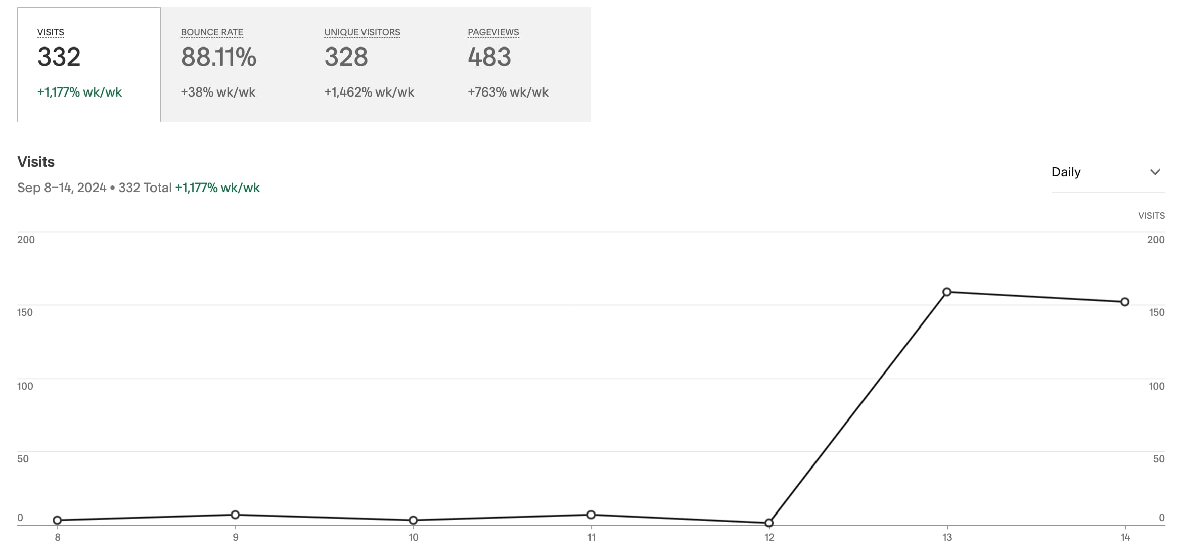
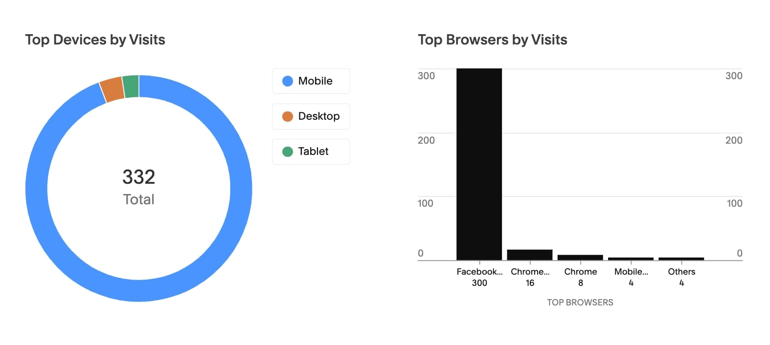
4.1 Results
After the launch of the Meta Ads, we saw significant results in session length and visits of the website, even on the limited budget. This, for me, meant that the website actually has a potential of even more conversions. I will let the results speak for themselves:
4.2 Impact
The redesigned website achieved a 30% increase in session lengths, with limited usability testing. Improved user flow and navigation around the website were noticed.